welcome to twin pines 2.0
Things are a little different around here huh?! I hope you're loving the new look and feel as much as I am.
A year on from the launch of Twin Pines Creative, it felt like an updated look and feel was in order. I was never happy with the original branding or creative but didn't want to let that hold me up starting a design studio. Instead I pushed ahead and since then I've had time to reflect and grow as a designer by working with so many amazing people. A year later and I'm in a much better place, know who I am and what I love. So what better time to make Twin Pines what I wanted it to be in the first place.
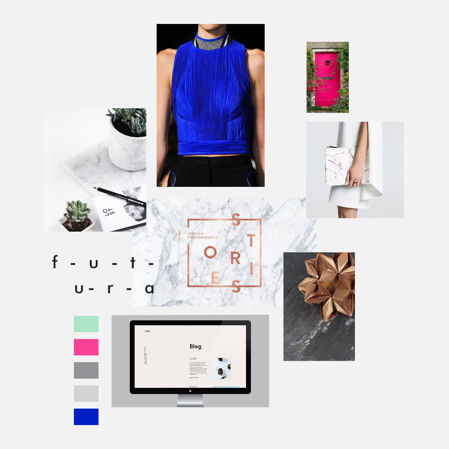
Branding yourself or your own company is one of the most difficult projects a designer can take on. Not only are you your own worst critic there are also so many things you like and ideas running through your brain it's hard to work out which ones to listen to. Eventually after lots of research, analysis and of course plenty of pinning, a moodboard started coming together.
A vibrant cobalt blue instantly stood out and was one of the first elements I knew I wanted to incorporate into my new branding, as blue has long been one of my favourite colours. However I wanted to use a more modern tone than I have in the past. From there it wasn't long before everything else started falling into place. A modern style combined with minimalism and elegance quickly formed and from there, the new and improved Twin Pines Creative was born.
In addition to the main logo the sub marks use a simple sans-serif typeface, however each include a stylised 'w' reflecting two pine trees (albeit upside down). A subtle feature but one that makes a huge difference. The main brand icon was also a lot of fun to work on. I've long been a fan of geometric designs and knew I wanted to incorporate it somehow into my branding and the brand icon seemed perfect for this. Not wanting it to be any old shape I sketched multiple shapes that incorporated a T and a P into it.
There's still a lot of work left to do behind the scenes in terms of updating templates and documents like invoices and questionnaires but I cannot wait to get started on these soon. The entire re-branding process has been so much fun and I'm so excited to get stuck into some more contemporary designs like this for other clients.


